Seven Seconds to Make Your Impression
A gallery director opens your portfolio. Seven seconds pass. In that blink, they decide: yes, or no. Not because they're dismissive or hurried—though they are. Because there are hundreds of submissions on their desk, and they've got twenty to narrow it down by end of day. Your portfolio has seven seconds to say who you are, what you do, why they should look further. Miss that window and you'll never know why the answer was no.
Your portfolio isn't an archive of everything. It's a curated selection—your strongest work, organised to create one clear, coherent impression. Think exhibition, not inventory. Except instead of gallery walls, it's a PDF or website. Same principles apply. Precision. Selection. Intent.
Less Means Better Quality
Most artists destroy their own portfolios by including everything. Forty, fifty works. Three series. Experiments in ceramics. College drawings. A field trip from five years ago. The result: a portfolio that says nothing. The curator flips through page twenty and has already forgotten where it started. What your core idea even was.
Ten to twenty works make a serious portfolio. Five to eight works suit an exhibition submission. Every single piece must justify its presence. If you're uncertain, cut it. Golden rule: if it's not in your top five and there's a stronger alternative, remove it entirely.
When you're working across multiple series, show one or two at most. A coherent series of five to seven connected pieces beats skimming superficially across five different series. Curators value depth. Consistency. A clear artistic voice. They want to understand your language, not browse a catalogue of experiments.
Structure That Works
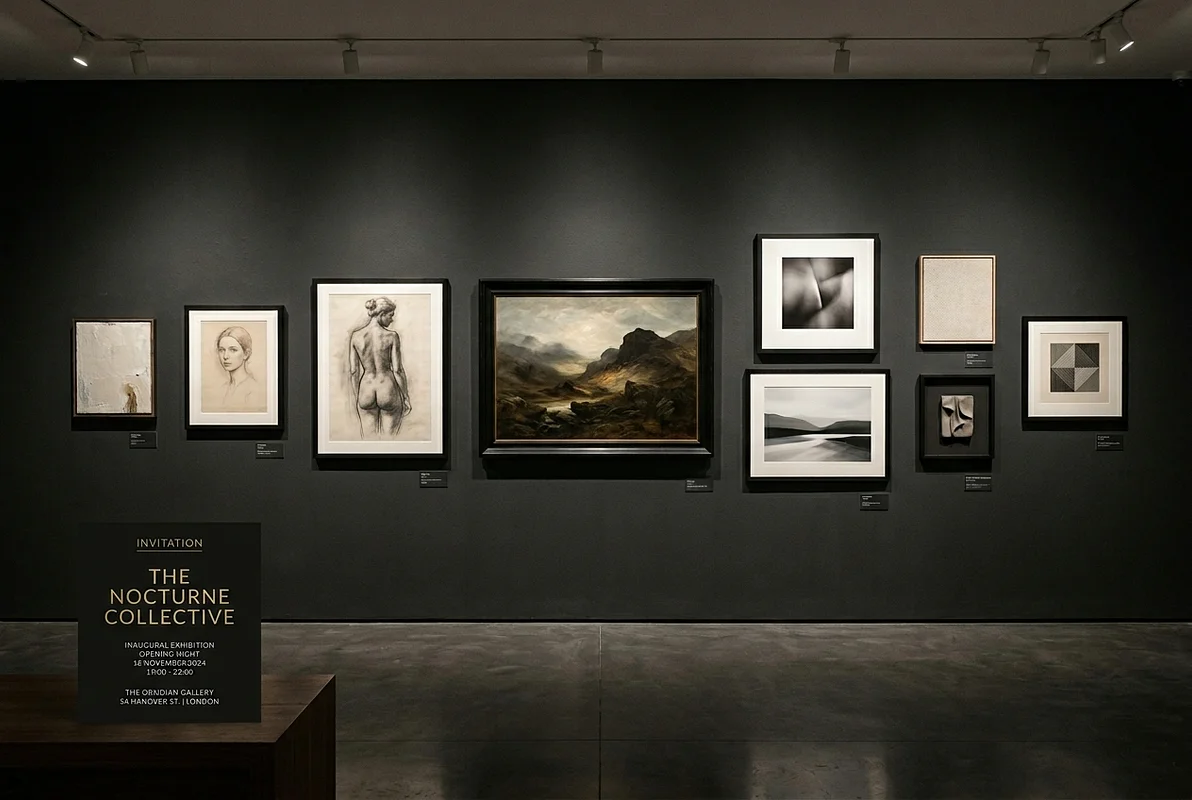
Lead with your strongest work. It sets the tone—everything that follows sits under that opening statement. Then arrange logically. Chronological or thematic, your choice. Both work beautifully. The final work matters equally; it's what lingers. Think album structure: opening track grabs, closing track stays with them.
Include captions with title, year, medium, materials, and dimensions. Professional standard. If the work's in a series, note it. If it's in a significant collection or was exhibited somewhere that matters—MoMA, Tate, Gagosian, a respected international institution—add one line. This context carries weight. For abstract or conceptual work, a single line on inspiration helps. Keep it spare: "Exploring colour and light" beats "An examination of the eternal questions of existence and transcendence".
Tailoring Your Portfolio
Work across multiple mediums? Create specialised versions. Your painting portfolio differs from your residency application. A competition submission is tighter than your online portfolio. This isn't dishonesty. It's professional strategy. Build one strong master portfolio, then adapt versions for specific purposes.
Rhythm matters. Don't dump images into a PDF. Think about pacing and flow. First image captivates instantly. What follows has logic. Final image leaves an impression. If you have several series, separate them clearly but ensure transitions feel natural, not jagged.
Update annually. Add new work from your current phase. Remove pieces that no longer represent your level. A work from five years ago, when you've progressed significantly since, can actually damage the overall impression. Quality matters vastly more than quantity. Ten strong new pieces beats twenty mixed ones.
Your Portfolio as Investment
Investing in a quality portfolio is investing in visibility. A strong portfolio opens doors. A weak one closes them. Don't wait for perfection. Even your first fifteen to twenty pieces deserve professional presentation. Review every quarter. Add new work. Remove weak pieces. If something feels diminished next to your new work, it has to go. Harsh rule, fair one.
This week: start reworking. Spend a day reviewing all your work. Select your top twenty. Narrow to ten or fifteen. Arrange them logically. Get a friend or colleague to review and offer honest feedback. Create a PDF and upload to your website or platform like Artsy or Saatchi Art. Launch at seventy percent and refine from real response. Don't wait.
Portfolio and Emotional Logic
A portfolio isn't intellectual presentation alone. It's an emotional journey. The viewer should feel something, not just understand. First image captivates. What follows deepens in complexity. Final image lingers in memory. When a portfolio evokes genuine feeling, continuation becomes almost inevitable. They'll look further. They'll tell others about you.
Why Selectivity Signals Professionalism
Here's what galleries and curators notice: an artist who includes everything looks uncertain about their own work. They're hoping something will stick. An artist who edits ruthlessly looks confident. They know which pieces matter and which don't. They understand their own practice deeply enough to distinguish between what's worth showing and what isn't. This distinction alone—before they've even looked at the work itself—sends a signal about your level of maturity as an artist.
The counterintuitive truth runs deep: showing fewer works makes a stronger impression than showing many. Five extraordinary pieces create more impact than forty mediocre ones. A curator might spend three minutes on your forty-piece portfolio and forget it entirely. They'll spend ten minutes on your five-piece portfolio, studying each work carefully, asking questions about your choices. Curation itself is a form of artistry. When you curate your own work, you're demonstrating you understand composition, sequence, and narrative. This ability to see your work through a museum visitor's eyes—what they'll notice, what will stick—separates amateur presentations from professional ones.
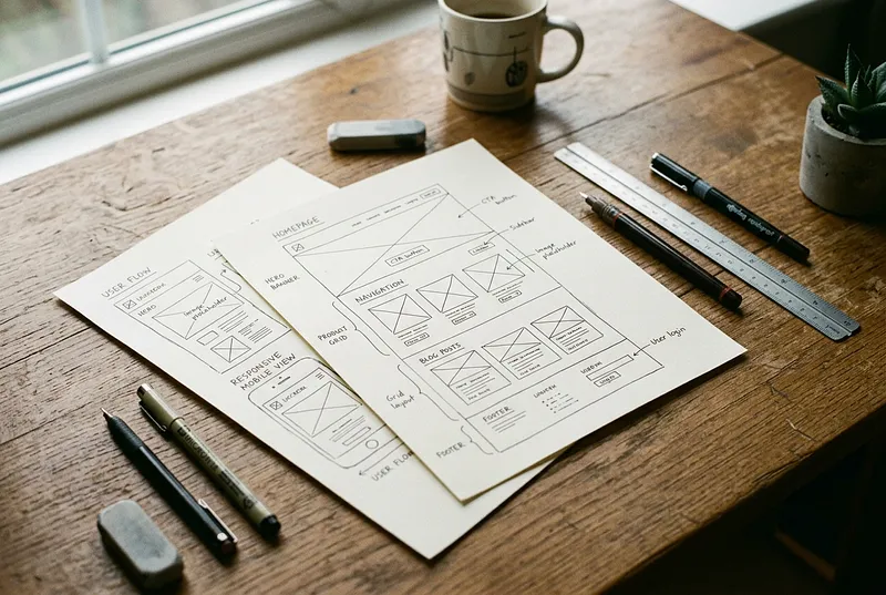
Digital Presentation Matters as Much as Content
Don't ignore the container. If your portfolio is hosted on a professional platform—a dedicated website, Artsy, Saatchi Art, or a portfolio service designed for artists—it immediately signals you're serious. If it's a poorly formatted PDF or images scattered across Google Drive, it signals the opposite. The presentation doesn't make bad work good, but good presentation makes good work far more visible.
Invest in clean, minimal design. White space. Proper image sizing. Easy navigation. Let the work breathe. From a web designer's perspective, technical excellence matters: fast loading times, mobile responsiveness, intuitive structure. A portfolio that looks beautiful on desktop but breaks on mobile loses credibility immediately. A site that takes ten seconds to load will be abandoned before the first image appears. These technical details seem invisible, but curators and collectors notice them at a subconscious level. Professional presentation builds confidence in the artist themselves.
Your portfolio is the voice of your practice. Make it speak clearly. First work engages, last work stays with them. Every piece between them is part of a larger story about who you are as an artist. It's your chance to show not just work, but your worldview.